
Atlas
Agro
Science
Atlas Agro Science, an award-winning Bulgarian startup renowned for its eco-friendly solutions, approached our team with a clear objective: to enhance trust and showcase their company's credibility. Specializing in green innovation, Atlas Agro Science has developed a patented process that converts sludge from Wastewater Treatment Plants into beneficial products. With the company's growth trajectory, they sought our expertise to position their products and startup as a credible alternative to chemical soil fertilizers.
Client
Atlas Agro Science
Year
2022-23
Category
Biostimulants, Green innovation, Landscape and Agriculture
Type of Work
Brand Strategy Visual Identity
Verbal Identity Print design
Web Design
POSM
Corporate materials
The Design of the Strategy:
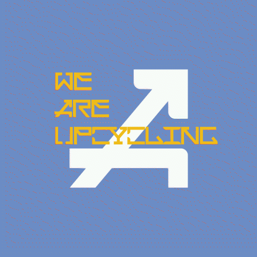
Our research clearly showed that the company's differentiation factor revolved around the real nature of their product and its patented process. Their approach towards eco topics differed significantly from other organic or bio fertilizer opportunities on the market. The company's innovation lay in making its products out of dangerous waste, embodying the essence of true upcycling: transforming the hazardous into the beneficial, the unsightly into the beautiful, and the process of improvement itself.
In developing the strategy and main narrative for Atlas Agro Science, our primary focus was on establishing its credibility and showcasing their commitment to green innovation through upcycling. Our narrative centered on emphasizing the environmental benefits of their products and their dedication to sustainable practices. By positioning Atlas Agro Science as a credible and trustworthy brand, we aimed to resonate with environmentally-conscious consumers and industry stakeholders alike.
The Strategy of the Design:
With upcycling as our guiding principle, we approached the design process delivering modern, colorful, and technology-driven identity. We focused on conveying the idea of renewal and upgrading messages, combined with innovation, professionalism, and reliability. As the cornerstone of the new identity, we crafted our own typographic style, called Atlas Display, available in both Latin and Cyrillic scripts, symbolizing the rewriting of the world's future in a new way. We decided to employ a vibrant color palette, featuring not only green but also a range of vivid and optimistic colors, reinforcing the brand's connection to nature, beauty, and sustainability. Based on this, we developed a full brand identity and marketing materials package, supporting various activation opportunities in social media, conferences, and outdoor activities.


We have developed a custom display font, crafted specifically for Atlas Agro Science. Inspired by the company's logo geometry, this typeface embodies the brand's core values – upcycling, innovation, and technology. The font has been developed in Bulgarian and English languages, including numbers and punctuation marks. It is in use for corporate communications, presentations, and marketing materials, giving a strong and recognizable visual identity to every message. The display font pairs seamlessly with Montserrat, used as the primary copy font.


